Various Works
Overview
This collection highlights how visual design plays a crucial role in building meaning. I started my design career with a strong focus on usability and best practices, but over time I’ve come to appreciate the power of bold, memorable branding. In a content-heavy world, a distinct visual identity can live beyond platforms and trends.
Credits
Special thanks to Meg Fiechter, Jonathan Black, Carmela Ocampo, Daniel Lurvey, Mao Velazquez, and the rest of my design community for your feedback and advice.
My role
Visual Design
Completed
2024
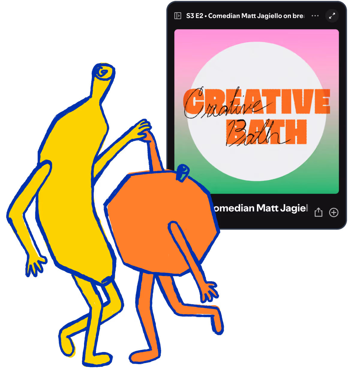
All Fruits Ripe
This project was for a couple who sail together and wanted a custom graphic for their sailboat.
Having Jamaican heritage, they were inspired by the phrase “all fruits ripe,” a saying that loosely means “everything’s good.”
They asked for two dancing fruits with a hand-drawn look that didn’t feel overly vector-based. Due to budget constraints, we had to select a palette that was limited to just three colors.
I began with loose sketches and visual references, leaning into the vibrant and eclectic feel of Jamaican art. The final illustration is expressive, joyful, and a subtle nod to their inspiration.

Creative Bath
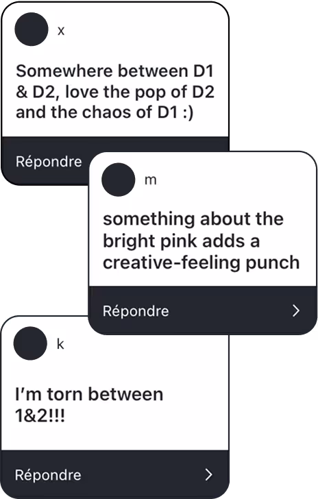
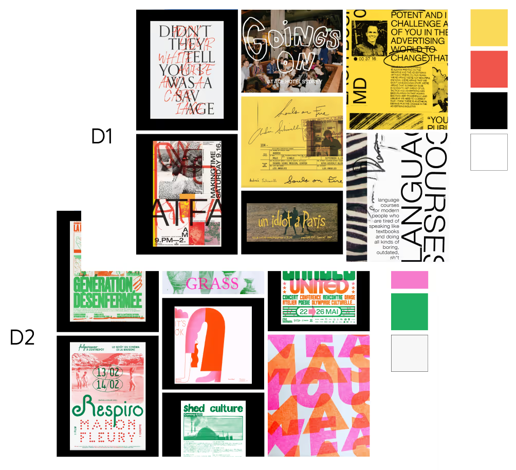
Creative Bath is a personal development podcast about creativity. I began with two moodboard directions and decided to open up the process by asking my Instagram community to weigh in.
The votes revealed a clear insight: the visual identity needed to combine the sketchy, in-progress feel of direction one with the bold, print-like textures from direction two.
The resulting cover uses saturated colors balanced with off-white grounding, textured gradients, and a hand-drawn type overlay.

Title Animation
This project was done as an intro animation that highlighted several internal motion pieces. The inspiration was modernizing the look and feel of old film productions.
Guerrilla Signage
After one-too-many package thefts due to a front door often left ajar, my friend asked me if I could make a sign for her apartment building.
We decided that a simple sign that encourages people to fully shut the door so that it locks was the right solution.
For the visual identity, I pulled ideas from environmental design in NYC and created several versions for her to choose from. The result is a collection of effective, fun sticker signs.
.avif)