Amy Myers MD
Overview
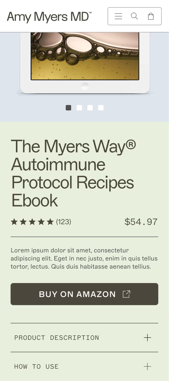
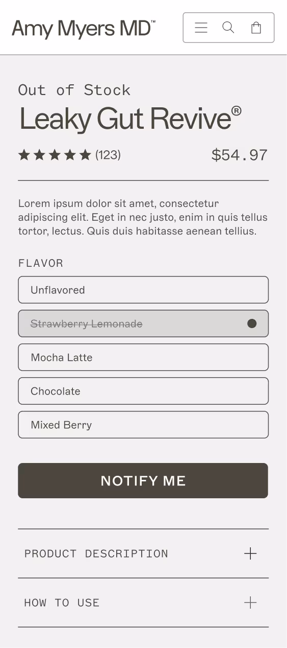
As part of our project offerings, I was tasked with auditing the existing Amy Myers site and recommending design activities. In the sales process, the Amy Myers team was impressed by all that my team had to offer, so they ended up signing up for a redesign using our custom Shopify theme called Bedrock. The UI challenge that my design lead and I faced was creating consistent core pages of the site that pushed the limits of brand but worked with the existing theme and low-fi wires. The photography used in mockups is for directional purposes only.
Credits
UI Leads — Jonathan Black & Daniel Lurvey
UX Design — Melanie Helgerson
Brand Design — Carmela Ocampo, Annie France, & Vero Romero
Art Direction — Bethany Schrock
My Role
UI Design
Completed
2024
Auditing the Initial Site
I paired up with a UX designer, Melanie, to audit the existing Amy Myers site. The insights that I gathered from the audit were then put in a pitch deck that ultimately won the engagement. Below are highlights from the audit I completed.
Opportunities
- Make components like product cards & banners consistent across the site
- Revisit text & button hierarchy
- Optimize the mobile site by introducing carousels, etc. to reduce scrolling
- Narrow down color palette of the brand to increase amount of impact
- Introduce more lifestyle photography highlighting the target audience
Why it’s Important
- A cohesive look & feel can elevate trust and appeal of the Amy Myers brand
- Visual consistencies help consumers understand the brand & offerings
- Designing for mobile is essential, as many consumers primarily browse sites on their phones
Recommended Activities
- Revamp the Amy Myers brand & create design directions
- Conduct research & competitor strategy audits
- Create a new UI Kit & focus on revamping the product cards
- Redesign core pages of the site
Kicking off the Project
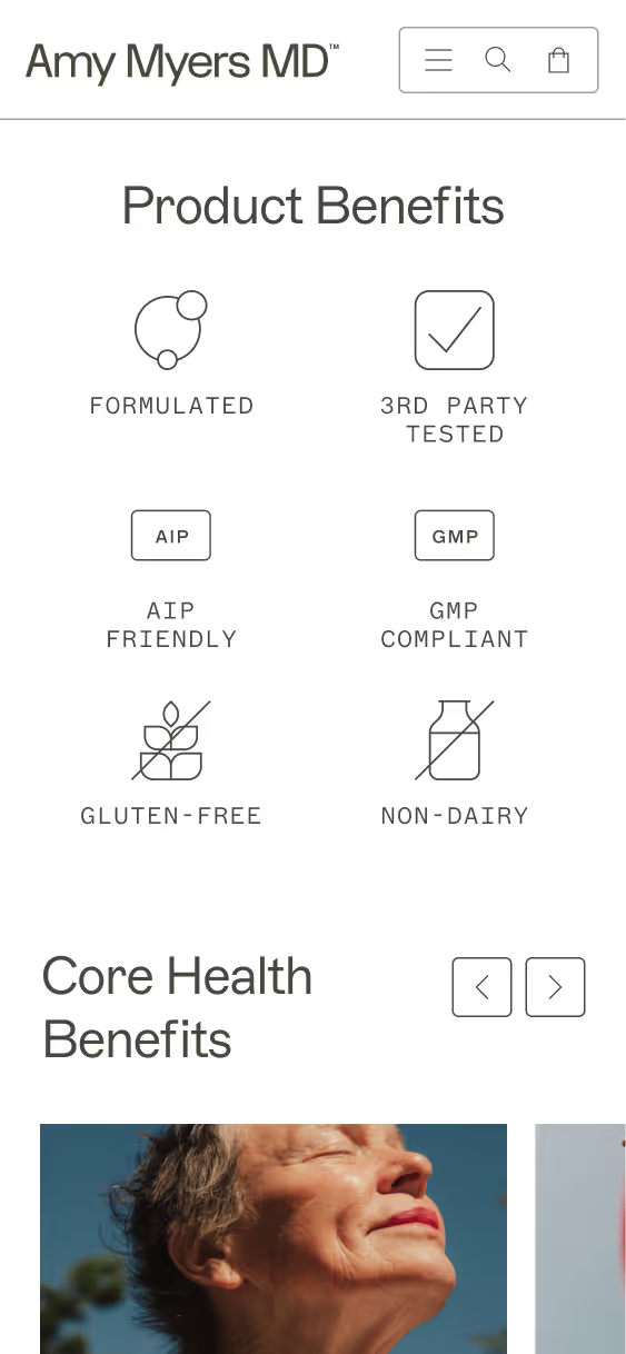
We started by building a comprehensive UI Kit to establish a consistent visual language. As we progressed with designing sections of the site, we refined the UI Kit by introducing new components, adjusting existing ones, and iterating based on design needs and client feedback.
Building From Lo-Fi Wires
The UI phase began after the UX phase, and we were provided with low-fidelity wireframes. As a result, many UX responsibilities such as messaging, interactions, and page heirarchy naturally carried over.
.png)
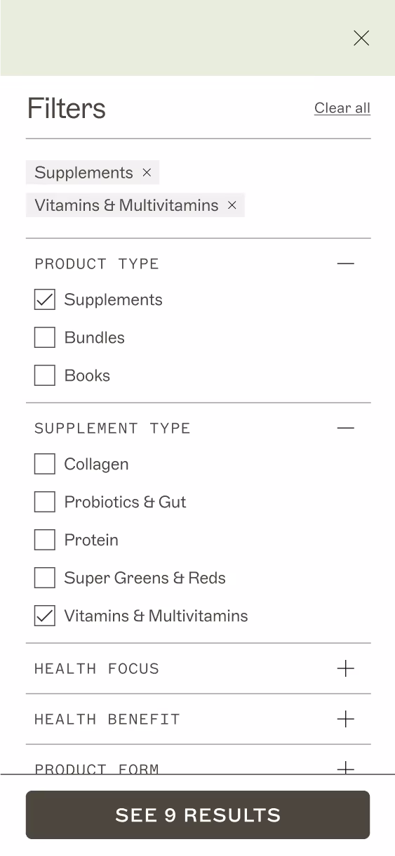
Designing for SEO
Our SEO specialists highlighted that the Amy Myers brand depends on their blog for a lot of traffic to the site. We focused on making the blog experience something customers would want to come back to for recipes and expert advice. We created a visually distinguished “Featured Article” and a filters section that is well differentiated from the company's competitors.
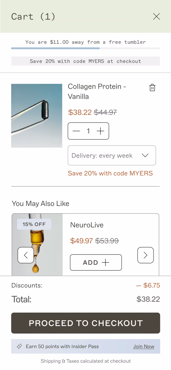
Optimizing the Cart
We designed a clean, functional cart that handled five different line item variations. We ensured that the cart also included a discount code badge, a loyalty banner, a free gift banner, and all of the necessary cart functionality.
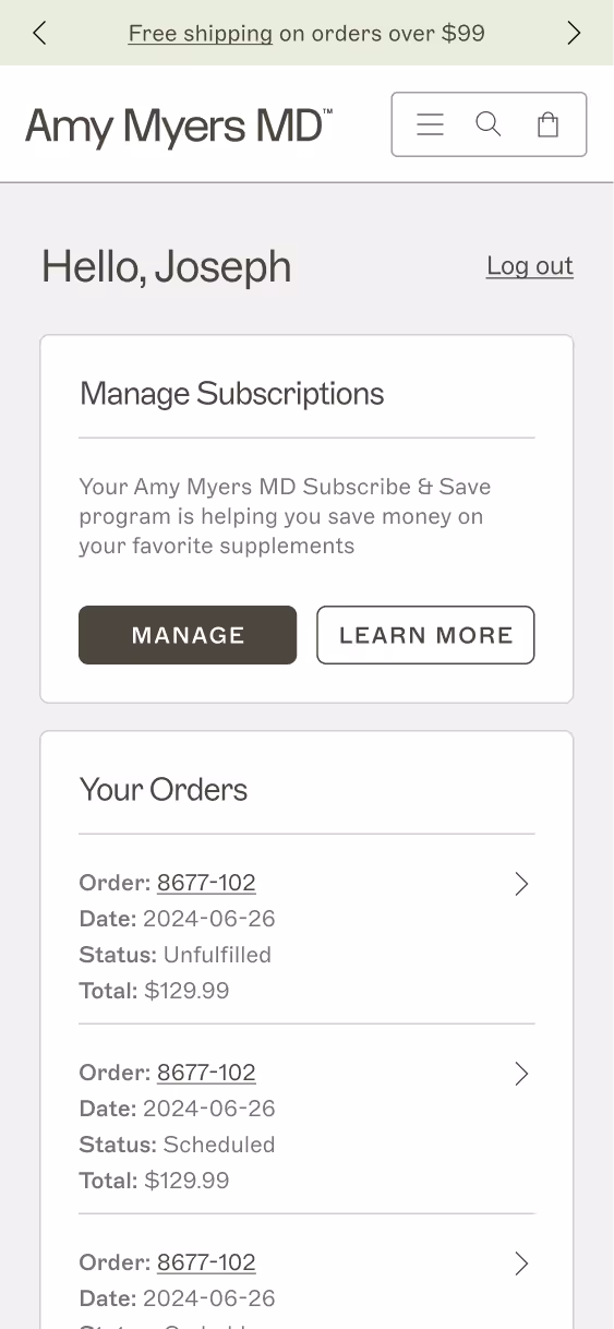
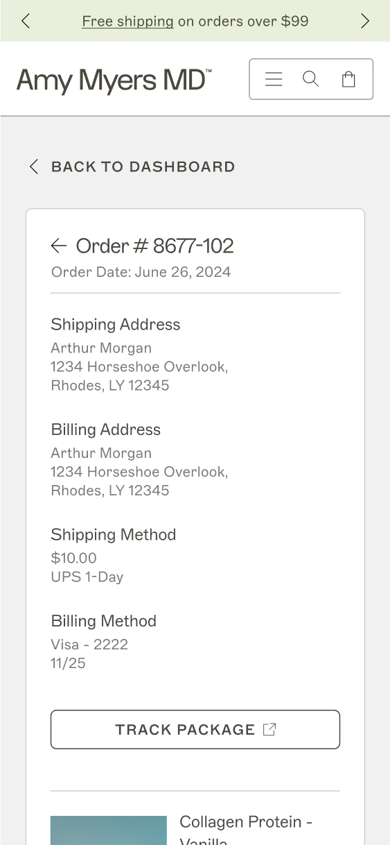
Balancing Aesthetics & Functionality
Since we introduced a clear visual language to core pages of the site, we also decided to push the limits of native Shopify Account pages. Structurally, we could not make many changes, but we applied visual elements like line work, color differentiation, and text hierarchy to make a consistent look and feel.
.png)
Outcomes
Fresh New Look & Feel
The client was pleased with the brand design and UI design, so much so that they also decided to revamp their package design as well.
Brand Differentiation
My team and I rose to the challenge of making a unique site in a saturated brand space. We elevated Amy Myers’ story, visual appeal, and product education.
Increased SEO
We made the site more discoverable by introducing robust filtering to the blog experience and reworking the information architecture.